Case Study
Fabbocord
A communication product concept exploring how chat and call workflows can feel familiar, fast and visually organized in a browser interface.
Overview
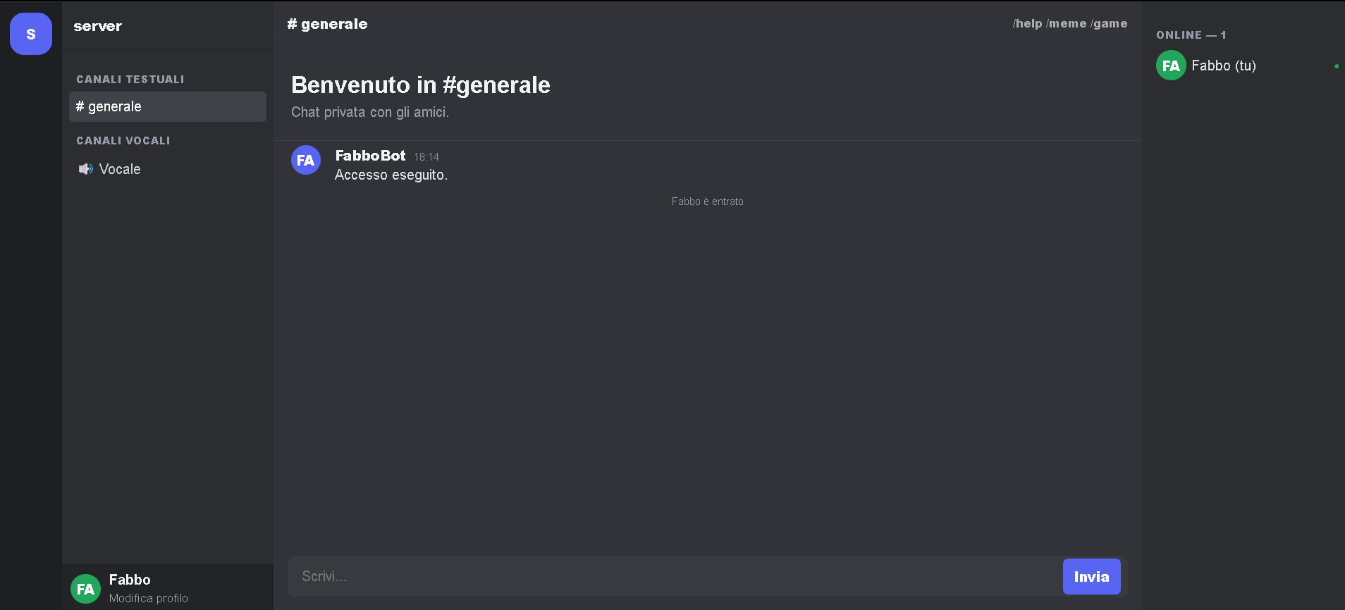
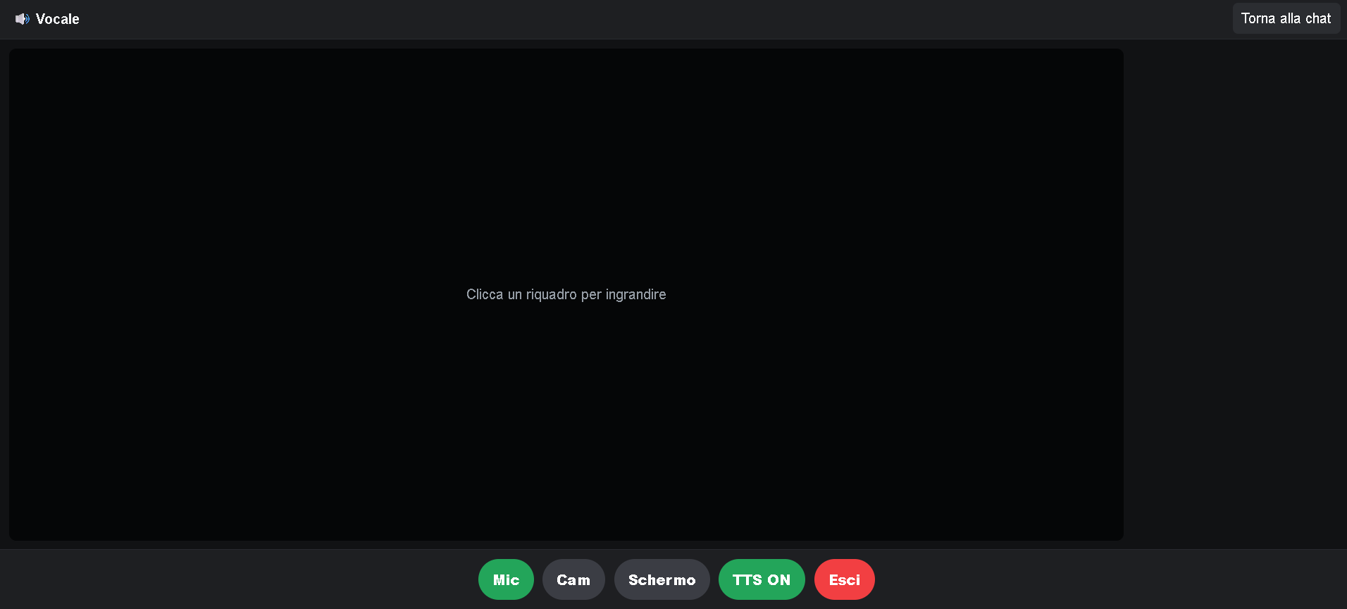
Fabbocord explores a team communication interface with dedicated areas for conversations, user context and call activity.
Challenge
Communication interfaces can become visually dense quickly. The design needed to separate conversation, navigation and call controls without creating friction.
Solution
I focused on a clear layout hierarchy, recognizable interaction patterns and restrained styling so users can understand the product without explanation.
Architecture
The interface is divided into chat and call states, with shared navigation and consistent component spacing across both screens.
Technologies Used
Image Gallery
Results
The concept establishes a complete visual direction for a communication tool and demonstrates attention to multi-state product interfaces.
Lessons Learned
Familiar patterns are powerful when the product category is already established. The work is in making the familiar feel precise and coherent.